
Tony Curran: Colour Separations
Tony Curran responds to political palettes in his new exhibition.
30 July, 2021
In Exhibitions,
Printmaking, Q&A


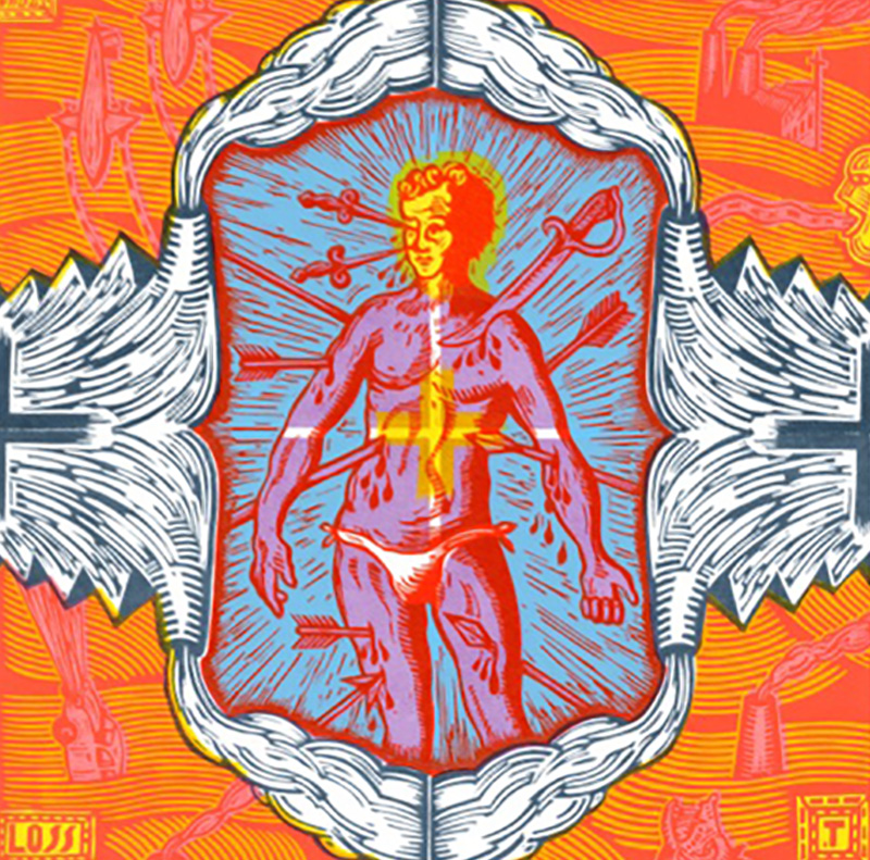
From top:
Synthetic Hot and Cool Attention Machine, 2020. Lithographic print on paper 58.5 x 45.3 cm. Image courtesy of the artist and VCA Editions. Photo by Brenton McGeachie
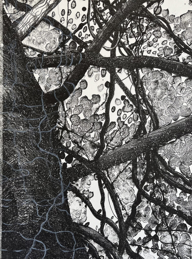
Cool Attention Machine #2, 2020. Etching aquatint on paper 69 x 55 cm. Image courtesy of the artist and Cicada Press. Photo by Brenton McGeachie
Cool Attention Machine #4, 2020. Etching aquatint on paper 39.8 x 30.3 cm. . Image courtesy of the artist and Cicada Press. Photo by Brenton McGeachie
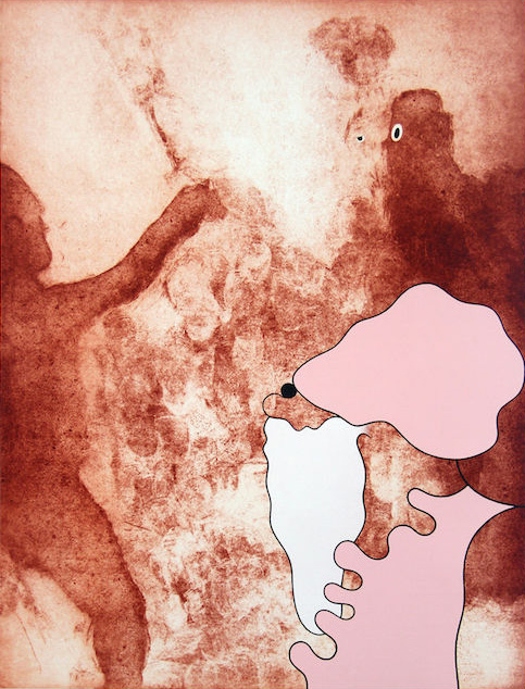
Growth Potential #1, 2019. Etching aquatint on paper 5 x 38.5 cm. Image courtesy of the artist and Megalo Print Studio. Photo by Brenton McGeachie
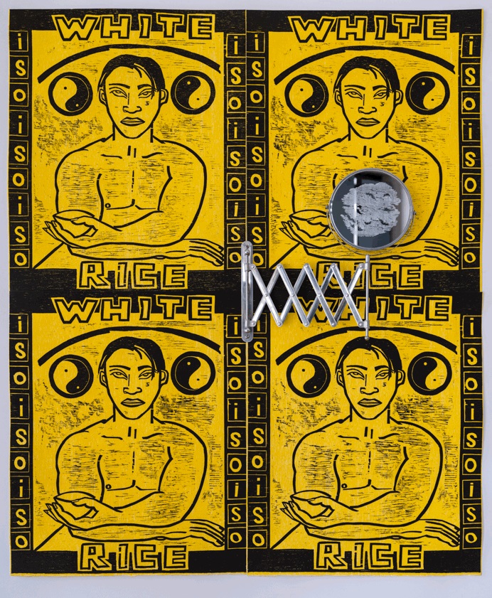
Pixel in twelve #3 (1-12), 2019. Acrylic screenprint on paper, 56 x 38 cm. Image courtesy the artist.
Q: What were some of the foundation ideas for this exhibition project?
A: When Donald Trump won the 2016 election, a poet collaborator and friend wrote a poem about those electoral maps where America is sliced up along red and blue states. Then as more came out about how the Trump campaign leveraged social media by targeting and personalising based on psychographic data I became obsessed with this idea that world events were increasingly being shaped by the stickiness and allure of these machines that were just made up of red, green and blue. Using just these colours, tech companies are able to entrance users into paying attention, which exhausts or strip mines the users attention. Psychological literature suggests that when people are exhausted in this way, they tend to end up in patterns of ‘black and white’ thinking, which are reactive, polarising, which is a problem when we’re trying to make the world green again.
I wanted to see if I could make works that explored this, with the possible mission of using a red, green and blue colour palette that would mine attention and then if possible in other works, attract attention and then strengthen the viewer’s attention, ie. pay the user back their attention with interest. So I called the works ‘attention machines’ and just started exploring how red, green and blue could arrive at works that enabled people to have a greater attentional capacity.
I had some print residencies coming up, with Cicada Press and Megalo Artist-in-Residence and so the language of this limited palette project suited a structure for making prints, where to use colour, you typically separate your colours out on plates, screens or stones before combining them onto the paper.
Q: How did the artwork selection take place?
A: Because the venue is a printmaking studio, I wanted to make sure I showcased all the results of works made with Cicada Press, VCA Editions and Megalo staff to foreground the diversity of approaches that different printmakers produce. I’ve been making paintings throughout the years that the prints were made, and I also selected works that show how my paintings, and coding have been shaped by the new forms that have emerged as a direct result of the print collaboration. So I’m trying to show off my collaborators as much as I can while exploring the diversity of red, green and blue as a colour palette that attracts repels and comforts.
Q: How does the exhibition manifest – what do visitors experience?
A: When visitors enter the gallery, they’re bombarded by a wall of ‘Hot Attention Machines’ which is a series of permutations of red, green and blue gestural colour fields. Directly opposite them is a screen which projects a ‘Dynamic Attention Machine’ that is piece of custom software that displays an infinitely adapting and moving-image version of the ‘Cool Attention Machines’ made with Cicada Press. All of the works except one are pure gestural abstraction, but with differing amplitudes of chromatic intensity. The aim with this, is that when someone feels exhausted by a work, there’s a neighbouring work that can catch them and hold them to ‘recharge’.
Q: What are some of the key works and what subject matter do they deal with?
A: All the prints and paintings oscillate between the hand-made and the digital paint mark or swipe. The subjects that they deal with are essentially the kind of endless swiping we constantly do on our devices. Some fo them feel angry because the mark has the pointy staccato of a Trump signature, while others carry an attitude of sprezzatura, nonchalance or grace.
There is one figural work which is the first of a series of children holding screens (phones or tablets). I did a range of residencies where I drew gallery visitors on iPads, and at one at the Wagga Wagga Art Gallery and there was a Mum who sat her infant down in front of me and gave him a phone to keep him still. So I made a three plate (red, green and blue separation) etching with Clare Jackson and Tim Pauszek at Megalo called Growth Potential #1. I’m hoping it sets the tone and the stakes for how we grow into digital dependence and how it shapes us in that process.
Q: What is it about the printmaking experience that you most appreciate?
A: Two things: How it makes me think about my work differently and how social the the print community is. Because I’m not a trained printmaker, I have grand ideas because I’m used to the plasticity of a painting process. But once I’m told how unfeasible my ideas are, I learn about the things that make etching, lithography and screen printing particularly magic. So when my ideas and processes interact with the affordances and limitations of print, it leads me to generate works that I love but would never have thought to make.
Then there’s the community. I took one invitation to make works with Throwdown Press and like a domino effect it led to collaborations with Cicada Press, a Megalo residency and VCA Editions. When I’m on the ground in these workshops there’s argie bargie, long lunches and friendships that I feel lucky to be a part of.
—
Colour Separations is at Megalo Print Studio from 31 July – 4 September.
https://www.megalo.org/colour-separations
—
Join the PCA and become a member. You’ll get the fine-art quarterly print magazine Imprint, free promotion of your exhibitions, discounts on art materials and a range of other exclusive benefits.