
Along the way: Roslyn Kean
Roslyn Kean discusses five decades of printmaking in her latest exhibition, Along the Way.
14 June, 2023
In Exhibitions,
Printmaking, Q&A


From top:
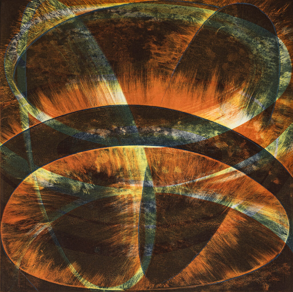
Roslyn Kean, Defining Shapes – Creating Edges, Venice, 2018, woodblock, 75 x 110 cm, edition of 3.
Roslyn Kean, Beyond Horizons II, 2001, multiblock woodcut and goldleaf, 76 x 56 cm, U/S
Roslyn Kean, Between Horizon and Shadow, 2014, multi-block woodcut and gold leaf, 76 x 56 cm, U/S.
Roslyn Kean, Ten Times Round, 1978, screenprint, 76 x 56 cm, edition of 8.
Roslyn Kean, Graphic Silence II, 2015, woodblock and gold leaf, 56cm x 56cm, edition of 4.
Photography: Irena Conomos. All images courtesy of the artist.
Q: What were some of the foundation ideas for this exhibition project?
RK: Arriving at five decades of art practice, the notion of reflection and identity are firmly at play. The influential years of study in the visual arts at a young age and the people who have mentored you have such a lasting impact on the direction of developing work and, in my case, the study of colour theory and design in Sydney under the guidance of Phyllis Shillito and Peter Travis had a very lasting impact. On completiing these studies, I entered the Slade School in London in 1976 by invitation to undertake postgraduate studies in printmaking and this provided an extraordinary opportunity to be amongst internationally celebrated artists who strolled the grand corridors and were always willing to share their passion for the lively art scene in London.
These years abroad are the foundation of the following decades of my work, and especially the years living in Japan and studying at The National University of Fine Arts, Tokyo (1985-87) where I was the recipient of a graduate scholarship to pursue research in traditional Japanese printing methods.
Along the Way sets out to identify some of the passages in my practice as a printmaker, my passion for colour, attention to detail and the concern for evoking the Japanese concept of ma, a pause, whether in space or time
Q: How did the artwork selection take place?
RK: Accepting the invitation to exhibit at the Grace Cossington Smith Gallery with the intention of showcasing works from the early 1970s until now involved an exhaustive initial viewing by gallery director Mary Faith. After several hours of making notes and snapping photographs Mary had the task of collating the images into sequential groups, all the time thinking of the gallery space and what needed to be culled. So many chapters of image-making and what makes a logical and worthy exhibition experience is the role of the curator; many works could not be included, which is difficult, but in the end there is limited wall space. Following a second viewing and printing out pages of thumbnail images, a final selection is made.
Q: How does the exhibition manifest?
RK: The intentions of this exhibition are to reveal the articulation of colour where tonal values of ink do not restrict but engage and invite one’s spirit to roam in other realms. I have an empathy for Japanese values in the structure of form and space to express a quiet moment, lingering silence, a place in time through everyday shadows. From childhood, simple patterns have held fascination, the rhythm of repetition, simple lines gathering forms in nature over time. In particular, I have used the triangle and square as symbols, repeatedly, consciously, and indirectly, using the closed forms to hold colour and find expression.
During the mid-1980s living in Japan provided the opportunity at the National University of Fine Arts to work alongside the most skilled woodblock carvers and printers who were recognised as national living treasures in their field and who generously shared this ancient process. I left Japan intent on pursuing this hand-printing process with a contemporary application and a determination to reach a refinement in my work through this medium.
Q: What are some of the key works and what subject matter do they deal with?
RK: Of importance in this exhibition are early colour works from my student days which are hand-painted in gouache and show a discipline in the execution of detail. These works reveal the dynamics of colour expression and a work ethic that has been integral to accomplishing the complex screenprints that followed later when working at the Slade School. Through the tonal separation process I would incorporate up to seventy different colours in a print such as Sahara No. 4 where minimal colour change is evident yet essential to represent the shifting light in the landscape over time. Following my research in Japan, woodblock printing became my preferred medium, which was a huge shift from the toxicity of screenprinting. I enjoy the natural surface of the relief woodblock; carving becomes meditative and there is endless play with colour choices once blocks are ready for printing. The use of pure pigment suspended in water provides a delicate inking medium and an added challenge working large scale.
The traditional kento cuts for registration of the Mokuhanga process suit my need for perfect alignment in my multi-block images allowing up to forty blocks individually printed into an image with extreme exactness.
A series of works titled Defining the Shape was intended to capture the subtlety of
of soft shadows created by simple layers in any environment, a symbol of layers of learning, layers of ancient voices as in Weaving Ancestral Voices. In this series of prints I also wanted to pay tribute to the 19th Century series of woodblock prints by Yoshitoshi, titled 100 Aspects of the Moon, which have the most modest colour schemes. I have chosen colour schemes directly from his works and limited myself to the colour scheme of a particular print in my own woodblock prints.
Q: What is it about the printmaking experience that you most appreciate?
RK: Over the years of developing my practice as a printmaker and researching the history of prints, the materiality of printmaking has been important. I love paper; the handling of paper is paramount, knowledge of fibres hidden within a sheet, its capabilities, level of performance under different conditions. Having reinforced my passion and knowledge for paper while living in Japan makes it possible for my images to work more successfully with the understanding of washi choice. In Japanese, the simple word for God is Kami and it is also the word for paper. The revelation of the inked image transported onto the surface of a piece of paper is always the moment of surprise and usually delight. The careful layering of printing employed in the Japanese mokuhanga technique allows for a careful build-up of saturation of colour, often up to eight layers of inking, which many other printmaking processes do not allow.
A quote that has stayed with me and is not likely to fade:
We shall not cease from exploration
And the end of all our exploring
Will be to arrive where we started
And know the place for the first time. T.S. Elliot
—
Along the Way is at Grace Cossington Smith Gallery 21 June-22 July. www.gcsgallery.com.au
—
Join the PCA and become a member. You’ll get the fine-art quarterly print magazine Imprint, free promotion of your exhibitions, discounts on art materials and a range of other exclusive benefits.