
2021 Print Commission: Carlos Almenar Díaz
In a new series of articles, we interview the PCA’s 2021 Print Commission artists about their working spaces.
16 September 2021
In Exhibitions,
Printmaking, Q&A


Main image:
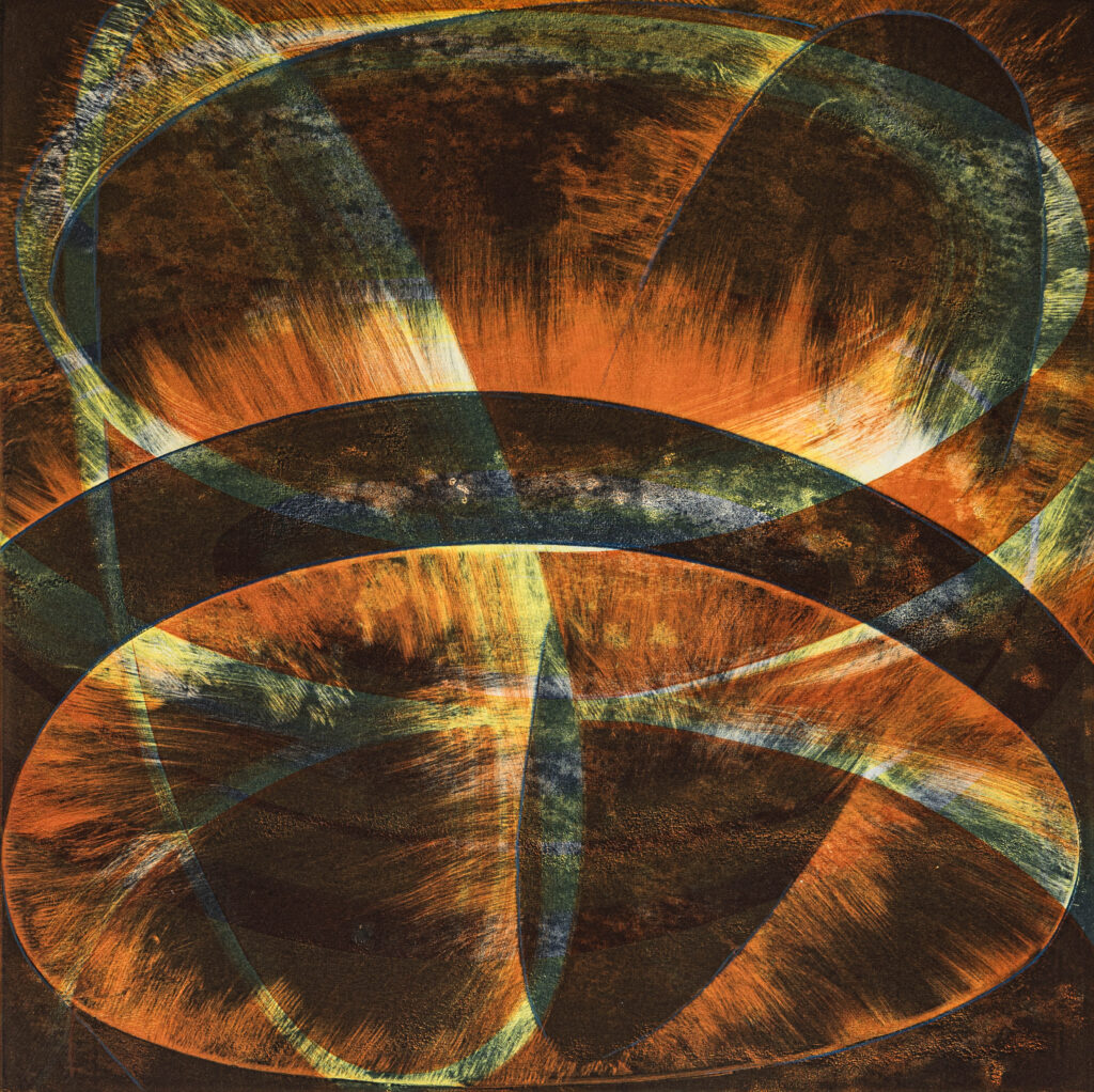
Carlos Almenar Díaz
Born 1974, Venezuela. Lives Vic.
Chromatic Linear Rhythm
Series 1-9
Ultrachrome archival pigment
Edition size: 40
Image size: 26.5 x 17 cm
Paper Size: 30 x 20 cm
This artwork is part of a series of
chromatic linear rhythms based on the
investigation between color and the visual
perception of rhythm. As a result, every
color that appears static is converted into
chromatic movements. This visual synergy
leads us to a peculiar perception of
colour that transports us from the reality
of the work to an alternative space, both
emotional and imaginary.
Carlos Almenar Díaz:
Throughout my 25-year career in banknote design, I have studied colour theory and in particular geometric patterns, extrapolating these ideas into the development of banknote design concepts and banknote family series. These chromatic perceptions and patterns forms have been created for the representation of a range cultures and communities’ beliefs throughout the world. I believe that the dynamism between the design concepts, chromatic theories, and the printing process, makes a perfect synergy between visual design and art.
After multiple investigations regarding geometry and colour, I discovered that Op-art is one of the artistic techniques where chromatic phenomenon in space has been deeply investigated. My artwork continues to seek the further exploration of the optical experiments between the phenomenon of colour, visual rhythm, and ourselves.
Since the Second World War, a new generation of artists appeared who investigated abstractionism and optical visual effects with the main foundation that the viewer has active participation in the artwork.
Based on different compositions and techniques, at the moment, I work on the development of the chromatic series: linear rhythmic, concentric rhythmic, and aurora rhythmic.
Each of these series has a different result, as an example, for the art that I have presented for the PCA’s 2021 Print Commission, the focus is between the combination of colour and linear rhythmics. In the other series that I am developing, the approach is a little more different since concentric or curved rhythms are combined with the colours, but there is an optical illusion about the colour since the viewer or person sees chromatic effects such as the aurora, or colours that are not really in the artwork.
Another important project that I am working on at the moment is the research on money art. I have started to develop some ideas with the combination of colour, rhythmic lines and visual elements of a banknote. That is, the synergy between Op-art and money art.
I develop my artworks with digital techniques, and I print them with ultrachrome archival pigment on cotton paper; this is my standard and always will be. My experience as a designer has been enriched by different banknote printers in Europe, Latin America, and Australia; where the design technique is done entirely in digital to originate the lithographic printing plates, serigraphic and engraving intaglio. However, I wish to do some artistic work in the traditional printing technique.
Today I am experimenting new techniques and materials such as aluminium, acrylic, plexiglas and vinyl. It is incredible to look at the chromatic perspective and the visual outcome from each of these supports. I plan to combine 2D printing with 3D supports. So that is the plan; I still have to work on it to achieve that combination.
—
Join the PCA and become a member. You’ll get the fine-art quarterly print magazine Imprint, free promotion of your exhibitions, discounts on art materials and a range of other exclusive benefits.