
RSVP
The second RSVP collaboration between the Firestation Print Studio and Southern Highlands Printmakers pairs twenty artists from each studio with each other—they exchange prints and then create response prints. The new works are presented to illustrate a conversation and exchange between each pair of artists as they draw inspiration and influence from the other’s print. One pair, Robin Ezra and Karen Neal, reflect on the experience.
31 October, 2025
In Exhibitions,
Printmaking, Q&A
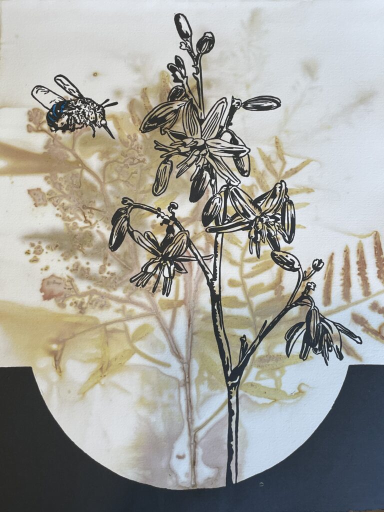
Top:
Karen Neal, Okami-inko (Cockatiel), 2025, monoprint and linocut with chine collé.
Below:
Robin Ezra, Woman with Umbrella after Kitagawa Utamaro I, 2025, drypoint and monoprint, plate 29.5 x 21 cm paper 38 x 28 cm, edition 1 of 2 EV.
Karen Neal, Red Tailed Black Cockatoo Pair, 2025, hand-coloured linocut
Robin Ezra, Courtesans after Kitagawa Utamaro, 2025, lithograph with printed chine collé, plate 29.5 x 20.5 cm, paper 40 x 30.5 cm, edition 1 of 10.
All images copyright and courtesy of the artists.


Q: What were some of the foundation ideas for this exhibition and how does it reflect your artistic style?
A: (Karen Neal): I have an ongoing body of work that focuses on Australian parrots, starting with local species and expanding as I travel and gather references. My RSVP print adds to this expanding series and features red-tailed black cockatoos, inspired by new reference photos from an artist friend. For this series of prints, I endeavour to express the bird’s character with a graphic linocut adding colour as needed to identify the bird species.
I employ various printmaking methods in my work. Linocut is my most preferred printmaking technique, sometimes with hand-colouring using watercolour, but I also use monoprint and collagraph depending on the nature of the subject and sometimes I may combine techniques if creating a unique-state print.
(Robin Ezra): The foundation ideas for Woman with Umbrella after Kitagawa Utamaro I began during a trip to Japan earlier this year. I was deeply inspired by the timeless simplicity and elegance of traditional Japanese woodcut prints. Their refined use of line, restrained design and quiet balance of colour spoke directly to my sensibilities as a printmaker. In these prints, there is a profound sense of calm and presence, an ability to suggest mood and atmosphere through the most subtle means. I was struck by how much could be expressed through so little.
While in Tokyo, I came across a small gallery where a contemporary printmaker was painstakingly recreating Edo-period prints using the same tools, papers, pigments and techniques used more than a century ago. Watching his process was mesmerising because of the layering of colours, the delicate registration and the patience it demanded. It reaffirmed my appreciation for printmaking as a process grounded in both craftsmanship and quiet contemplation. I found myself thinking about how I could bring that same sense of restraint and refinement into my own practice, while still allowing for the expressive qualities of the techniques I use every day.
Before leaving for Japan, I had already agreed to participate in the print exchange with Firestation Print Studio in Melbourne. As I travelled, I began forming ideas for the piece. I would submit something that could pay homage to the Japanese tradition but would also reflect my own sensibility and technique. When I returned home, I began developing Woman with Umbrella after Kitagawa Utamaro I, a drypoint and mixed-media print that draws directly from the compositional elegance of Japanese masters like Utamaro. The image depicts a woman holding an umbrella that covers about half the back of the composition which is a motif often seen in Japanese prints. I had been teaching drypoint in my classes over the past few terms and was curious to see how its soft, velvety lines could lend themselves to the understated beauty of Japanese imagery.
To complement the line work, I created a mono watercolour plate to introduce delicate tonal layers, giving the print a warmth and luminosity reminiscent of traditional woodcut colouring. The final piece carried a gentle harmony between softness and structure, the qualities I feel are central to my artistic style. I was pleased that it captured both the quiet spirit of Japanese design and my own continuing fascination with the expressive possibilities of printmaking.
Q: What were your thoughts upon receiving the work you were paired with? What did you draw on to produce the response print?
A: (Karen Neal): The Japanese-style print differed significantly from my nature-inspired work in theme, style and technique. It was a little daunting as no response spontaneously sprang to mind, so it necessitated careful consideration and research on my part.
Ultimately, I selected cockatiels as the focal subject—an Australian native parrot that is also widely kept as a pet in Japan. Distinguished by their orange-red cheek patches, yellow facial markings and the yellow bands found on the undersides of female tails, their colouring closely reflects the palette seen in Robyn’s print. In Japan, cockatiels are referred to as okame-inko; “inko” denotes small parrots, while “okame” references a traditional Japanese mask with blush cheeks. My reference drew upon a pair of cockatiels that I kept as pets many years ago.
(Robin Ezra): My first thoughts were about visual dialogue, how to create a response that would both converse with and complement Karen’s image. I wanted to maintain the Japanese theme but also reflect the paired composition of her birds. Eventually, I found an old print of a courtesan and her attendant, which I adapted to echo the relationship between the two cockatoos. By flipping the umbrella motif from my earlier work to the opposite side of the Courtesans after Kitagawa Utamaro image, I created a subtle link between the two prints. The figures in my response print mirrored the intimacy and togetherness seen in Karen’s work, while still retaining the elegance of Japanese design.
Q: What are some of the key ideas of your prints and what subject matter do they feature? Did your response print deviate from these ideas/subjects?
A: (Karen Neal): My print practice is nature-based, drawing from my local environment, be it at home, my local reserves or from places I visit. I have always been fascinated by plants and animals, the behaviour of birds and how both plants and birds adapt to their environment. This has led me to explore through my printmaking the unique behaviour and visual characteristics of birds such as in the Australian parrots series. My approach often involves observing the interactions between birds and their habitats, seeking to capture not only their physical traits but also their behaviours and the ways they interact with local flora. I integrate these observations into my prints with the aim to convey a sense of their relationship and the connectedness between wildlife and their environment.
For my response print I decided to keep with my Australian parrots by choosing a pair of cockatiels, but they are far from their natural environment as pet birds in Japan.
(Robin Ezra): For the response print, I chose waterless lithography with chine collé printed colour. Waterless lithography is a technique I have used and taught for more than fifteen years. Unlike the soft and tonal quality of drypoint, waterless lithographs provide a crisp, graphic finish with clean lines and strong definition. It felt appropriate for this stage of the dialogue, a kind of visual counterpoint to the gentleness of the first print and to the strong linocut image that Karen supplied. The process demanded a different way of thinking: sharper contrasts, more deliberate composition, and careful consideration of how colour interacts with form. Adding chine collé allowed me to introduce subtle shifts in colour, tone and texture, maintaining a sense of warmth within the stronger framework of the lithographic line.
Q: Did the project challenge you? Did your approach to your response print deviate from your known/usual printmaking processes?
A: (Karen Neal): The RSVP project challenged me to think creatively as I endeavoured to create a print that complemented both Robin Ezra’s work and my own and included elements from both. I loosely picked up on culture, colour and design elements to pursue in creating my response print.
My usual process involves working with drawings, photos and natural materials such as plants and parts of plants that I can arrange to develop into the print design showing the natural relationship between the elements.
For my response print, I needed to reimagine the Australian cockatiel in its new country as a Japanese pet parrot. I created many experimental prints to help refine my ideas as I find making prints helps me more than trying to visualise an idea in my head. The background in the final print was created with a rainbow roll in colours to enhance the colour harmony between the original prints. Japanese origami paper was selected for its colour and pattern: the chine collé circle reflects the umbrella’s shape, while the blossom origami pattern references part of the kimono fabric. The popular Japanese cherry blossom forming part of the new environment for this cockatiel pair.
(Robin Ezra): This project challenged me in ways that felt both technical and conceptual. It asked me to respond not only to another artist’s imagery, but also to reflect on my own visual language and how it might evolve through conversation and exchange. It reminded me how dialogue, whether between artists, cultures, or techniques, can open new creative pathways.
What I most appreciate about the printmaking experience is this capacity for continual discovery. The repetition of process—the inking, wiping, printing and reprinting —becomes a form of meditation. Each impression carries a slightly different life, and in that subtle variation lies the joy of the craft. Printmaking is never static; it is a living process of translation, transformation and renewal.
Q: What is it about the printmaking experience that you most appreciate?
A: (Karen Neal): I most appreciate the versatility of the printmaking process—that you can make multiple prints as an edition but can also recut plates, combine different plates and print techniques to produce unique state works and artist books. The options seem endless and so inviting to pursue.
(Robin Ezra): Participating in the print exchange has reaffirmed for me how collaborative projects can spark new directions in your practice. Through engaging with another artist’s vision, I found myself extending my own, returning to familiar techniques with fresh eyes and rediscovering the beauty of simplicity. This experience has set me on a new path to explore more works inspired by the timeless grace and quiet power of Japanese woodcut prints, interpreted through the expressive language of contemporary printmaking.
—
RSVP is at the Print Council of Australia, Studio 2 Guild, 152 Sturt Street, Southbank, 5-21 November. Opening Event: Thursday 6 November, 5-7pm
—
Join the PCA and become a member. You’ll get the fine-art quarterly print magazine Imprint, free promotion of your exhibitions, discounts on art materials and a range of other exclusive benefits.